Checkout Process Optimization
iSmartAlarm Website
UX / UI

TASK.
Redesign and Improve the Checkout Process for iSmartAlarm e-Commerce Website.
Why this task?
On top of that, considering more than 50% of our page visitors come from a mobile device, it's certainly to optimize the checkout experience on mobile at this time also.
iSmartAlarm provides the smart home security system to customers, and sell hardware products on their own e-Commerce website. The checkout process is the final step to convert a visitor into an actual product user where our revenue comes from.
Our current checkout process is embedded in existing e-Commerce platform. Applying a read-made checkout plugin with this platform requires an upgrade, which is not doable at that stage.
e-Commerce Product Manager,
Engineer Team,
Sales Team & Shipment Team.
Work With.
I took over this design project from a previous designer with some approved achievements.
As a UI/UX designer, I get involved in all stages of design including user flow, wireframe, prototype, interaction design, and test cycle.
My Role.
EMPATHY / INSIGHT.
Assuming users have already decided to purchase, clicked the check out button and jumped to the checkout page.
What’s the biggest barrier to finish the checkout for users?
Completing the form with a scrutiny.
What’s the worst situation during the checkout process for a company?
Users quit, or can’t finish the form-fill, which also known as abandon rate.
So, how do we reduce the abandon rate?
Help users complete the form correctly and efficiently.


DISCOVER
/ IDEATE.
What we can do to help users complete the form more correctly and efficiently?
Previous Flow
-
6 separate steps are clear, but acting as an overwhelming task that users need to finish.
-
The order of steps is not well organized.
-
Lack of considerable error feedbacks or error preventions when users make mistakes.
-
Old interface.
-
Not align with this company’s new brand visual identity.
Problems:
-
Optimize and simplify the checkout user flow.
- Tackle with error: prevention, feedback, editable.
-
New user interface with better usability.
-
Mobile friendly.
Opportunities:
Keep in mind:
First of all, checkout is a general path that requires almost the same essential information to complete the task. Keeping the consistency with the general checkout experience is the important principle we should apply on, which will reduce the cognitive cost and enhance the efficiency for users.
Also, as this project’s final goal is to increase the completion rate of online sales, we shouldn’t forget the checkout process is a part of the whole continuous behaviors of a purchase.

SOLUTION.
Enhance the form-fill efficiency.
Address Input & Verification:
Introduce the Address Auto-Complete API from Google Place into our address input section to replace our old ZIP CODE address verification, which can help users finishing this annoying address input quickly and reducing input mistakes.


Payment Card Input:
Remove the "choose card type" step by detecting inputted card number to Auto-Recognize Card Type, which combined two steps into one.

Group steps related, dig in the flow.
Struggling:
It's easy to group related steps in mind and map it out on design software. However, after a battery of discussion and confirmation back and forth with the developer, we found out it requires plenty of unexpected back-ends developing works.
Considering the enhancing checkout efficiency is our primary goal of this project, and simplifying the steps is the key to this improvement, we finally decided on the new grouped user flow.

Work on the error and mistakes.
Prevent Error In Advance:
By applying input validation and proper interaction process from front-end, we can prevent users from inputting information mistakenly before they submit to the back-end.
Provide Better Error Feedback:
When users submit the request but still got something wrong, proper error feedback can help users figure out where and what is going wrong.
We all know that ideal error feedback should be shown next to where the mistake is, while limited with our developing resource and e-Commerce platform's capability, we compromised our solution to place Error Feedback on the top of the form where we can force users to see it after the page refreshing.
Review at a Glance:
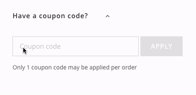
We make each step editable and easy to find during the checkout process.
Confidence on Purchace
Payment Secured Badge

Easy Access to EDIT:
We have EDIT access discoverable at every steps for users who want to make some change or find some mistake they made on the previous step.

Responsive Implementation:
Having a mobile-friendly checkout process is not only about UI, affected by the small screen and different interaction behavior on mobile, there is also plenty of extra design detail twists and additional developing cost.
To have things done, I communicated with engineer deeply, learned a lot of developing knowledge from their aspect, and compromise some design to make it easier to implement.
Responsive Capability with a Neat Interface
Branding-Attached UI, Better Usability:
Our current interface is old and lacking usability concern to some extent. Following the company's new branding and rethinking of the whole interaction details with better usability is definitely needed.
APPROACH.

Dig in deep in User Journey
/
When thinking of the checkout process is part of a continuous process of purchase as a whole, and go through each step it's clear to define what we need to improve.


Understand User's flow Combined With Engineer's Implementation.
/
The process of creating this flow helped me better understand the user-flow not only from the user’s aspect but also the feasibility feedback from developer’s execution. It helps me communicate with our developer remotely, treat a general checkout process specifically combined with our own d situation like we only can provide Paypal checkout after user finish our checkout page first (we need to update our PayPal services to have PayPal checkout at cart page.)
Backlog for the Next Iteration.
/
With the previous diving into the user journey and user flow, our team with engineers figuring out which is our current constraint and which of them is doable on our current e-Commerce system framework when we have more time and resources, it’s clear and easy to build a backlog to list out what we can do next and have more rational reason to prioritize them.
LEARNING.
The constraint is the reality, live with it.
When I suffered from lots of back-ends developing constraints back and forth which conflict with the ideal solution, it’s natural to wonder why don’t we integrate a ready-made checkout plugin to our e-Commerce website. However, the reality is for some reason our e-Commerce platform is hard to upgrade to integrate with new plugins and work on the whole platform will require much more effort, for sure it’s not the right time to expand project at this stage.
Figuring out the constraints as soon as possible is the key to set the right expectation for the result.
Loading / Waiting time counts.
Checkout process requires numerous interactions between front-end and back-end. Response time becomes the inevitable factor for the usability metrics of this project.
Decreasing the waiting time of response is the engineer's job while improving the feeling of waiting time is belongs to the designer. Loading states and add some micromotion are helpful to fill the blank time.
Involve feasibility tests as early as possible, back and forth.
I continued this take-over project from a previous designer with some approved progress, then encountered lots of unexpected stuck afterward. Lots of feasibility problems were caused by incautious design decisions.
What if we can go through the feasibility test more carefully and find out those problems earlier when we jump into real production? Testing is the only effective way to find out problems and no matter it happened during the design phase or after building phase.
As a result, I proposed a website project workflow to the team to get engineers early involved in the ideation stage which works well afterward. A right project workflow helps.
Error feedback / Edge case matters.
After working on the happy path, keep in mind that edge case always happen. People make mistakes especially no matter they are working on a simple task or an intrinsically complex one.
Make use of good error feedbacks to help people tackle mistakes. Error feedback should be placed in the right place, at the right time, and guide people to take the next action.